DD
MM
YYYY

PAGES

DD
MM
YYYY

spot_img

PAGES

Home Blog Page 5304

Tekedia Live – Business Growth and Lean Supply Chain – Feb 22 at 7pm WAT

0

The world of commerce is nothing but supply chain. If you improve your supply chain, you can have competitive advantages in the market. That improvement comes with deepening optimization, agility and lean management. Our faculty, Chibueze Noshiri,  on Tuesday will explain how to design, develop and execute a winning supply chain framework. The end result is business growth.

Mr Noshiri worked in DHL and UPS where he rose to Global Engineering EUD Manager – Global Logistics. Today, he sees supply in Barry Callebaut Group, Belgium which makes cocoa to become chocolates.

Zoom link in the Board school.tekedia.com


3 Networking Skills that Can Ease Fundraising

1

Fundraising may not be the most fun task, even for serial investors. Some directly say that they would rather have their co-founder do the fundraising round while they stick with running the business. But if you are a founder, it is something you will have to do at some point. One skill that can make this journey smoother for you is networking.

If you started a business, then retreated into your cocoon to run the business, in the hopes that someday, you’ll simply come out and look for someone to inject funds into your business, then you might need to prepare yourself for the rude brush with reality. Ahead of your fundraising venture, you should be interacting and networking with people in your space, as well as potential investors. If you are looking to attract investments from an angel group, for instance, it helps if you have some mutual connection or at least know someone within the group. Investors are aware that 50% of startups would have completely shut down within 5 years of raising funds, so they want to be double sure before investing.

Attending relevant events

Building a startup from scratch can be time-consuming and it can be draining, but if you cannot even find time to attend such events, then you need to reevaluate what you are doing. Yes, you want to build a solid startup right from the early stage. BUT, you also don’t want to go into fundraising to find that none of the names in your sector even knows you.

The persons you are building a connection with may not necessarily have the fund to invest. But you could approach an investor, who would call him to ask if he has ever heard about X person or X business. It would be a shame if your potential investor cannot even find one person who can vouch to know you and your business.

A captivating introduction to your business

Some people attend events and after introducing their name, they just introduce their business shoddily. “I am trying to start a small tech business” or “I have this small business I am trying to …”

This is wrong. No matter what stage your business is in, you should never be the one to describe it as small. You never know who could be listening. When you are in the company of others, introduce your business in the most captivating way possible. Have a 30-second pitch that covers what your business is about, what problem you are trying to solve, why you are passionate about it, and where you hope to take the business to. If you need to rehearse it after writing it down, do so and perfect it before using it.

Just 30 seconds of talking about your business should be sufficient to catch the interest of your listener in what you do. Always have your elevator pitch ready. Make it memorable. People hear a lot of introductions and semi-pitches. Yours should be one of the few they don’t forget. If handled right, you can find someone who would tell you to contact him or her anytime you are looking to expand or raise funds. It can sound something like “I know someone who loves investing in businesses like yours. Please inform me whenever you decide to raise funds or expand into other states”.

Be intentional with your business card

Do not be one of those who think a business card is just for giving out your contact details. Your business card can tell a lot about your business. That’s why it is a business card and not a contact card. One face of your business card should have bullet points about your business, just like an extension of what you have conveyed in your 30 seconds power pitch.

Include your contact details as expected. For the web address, you should have the link to an investor-oriented landing page, in addition to your general website. Such a landing page should be targeted at giving a deeper insight to intending investors, and do not refrain from crunching the numbers on this page. The person you give the card to, may not be an investor but could pass it on to one.

Trump’s Social Media App ‘Truth Social’ Launched

0

About a year after he was kicked out of major social media platforms for using his account to instigate the Jan. 6 Capitol riot, which resulted in the death of more than five Americans, former US president Donald Trump has launched his own social media – Truth Social.

Truth Social has been under development for months now, a push Trump is making to bolster his aim at the 2024 presidential election, which very much depends on his social media presence.

The platform was launched in Apple’s app Store late Sunday night, and was available to download shortly before midnight ET. It is only available in the United States now. A report said the app was automatically downloaded to Apple devices belonging to users who had pre-ordered it.

Trump has been seeking ways to return to social media after the ban cut off communication between him and his supporters. Early last year, Trump launched a website to substitute for his lost social media accounts, but it failed to gain patronage even from among his supporters. Truth, which has the backing of Digital World Acquisition Corp. (DWAC), is so far the biggest chance to potentially put the ex-president on social media’s center stage and according to him, rival Big Tech.

“I’m excited to soon begin sharing my thoughts on Truth Social and to fight back against big tech, Trump said last year during the announcement.

The Truth Social operates under Trump Media & Technology Group (TMTG), which was created through a merger with Digital World Acquisition Corp. The group said it seeks to become a publicly listed company.

However, the launch of Truth does not guarantee that Trump will regain his famous social media presence as it requires millions of users to bring the platform to limelight. Former Republican U.S. Representative Devin Nunes, who leads the TMTG, is optimistic that the app will thrive, and has started urging people to download the app and sign up.

“This week we will begin to roll out on the Apple App Store. That’s going to be awesome, because we’re going to get so many more people that are going to be on the platform,” Nunes said in a Sunday appearance on Fox News’ “Sunday Morning Futures with Maria Bartiromo”.

“Our goal is, I think we’re going to hit it, I think by the end of March we’re going to be fully operational at least within the United States,” he added.

Truth features

Talking about the features of the app, Nunes said it will function for now without an edit button. He explained that there will be direct messages, or DMs, between users.

“The company is also considering allowing users to sign up to receive notifications when others post content,” the executive said, adding that there will always be block functionality in the app.

Nunes also explained that Truth Social will issue a policy on verified accounts “in the coming weeks.” These features, as explained by the executive, suggest that the app is a Republican version of Twitter.

TMTG, which raised $1 billion in December from private investors, is planning to list in New York through a merger with blank-check firm Digital World Acquisition Corp. and stands to receive $293 million in cash that DWAC holds in a trust, assuming no DWAC shareholder redeems their shares, according to TMTG’s Oct. 21 press release.

Reviewing New MTN and Flutterwave Logos

4

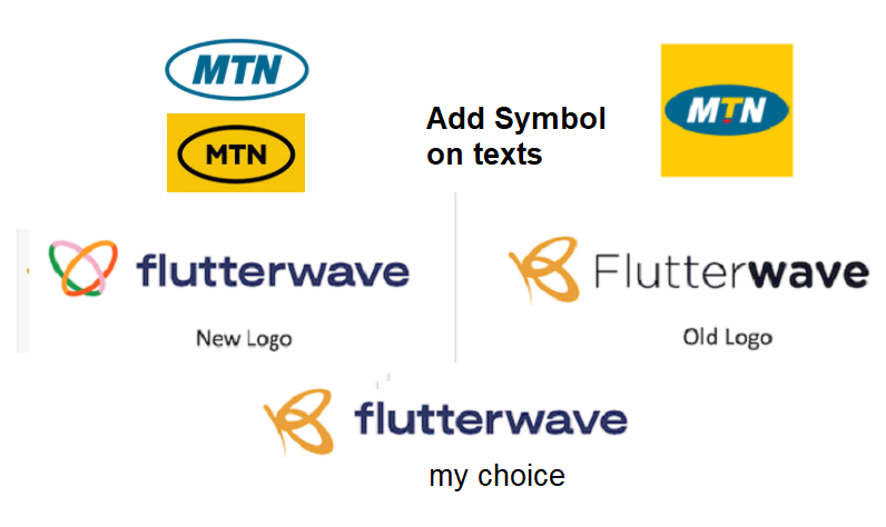
First, I am not a branding expert. So, anything I write here is irrelevant. Nonetheless, I see my feed as a mini-school. So, we can co-learn. MTN and Flutterwave recently updated their logos. My call:  I do not like either.

On MTN: the new logo is a win for very well educated users but for non-educated customers who continue to use colors and shapes to associate consumer brands, they could be adding a marginal confusing layer. Using pure black for a consumer brand does not cut it for me. (However, I have read that the black is actually blue.)

Vanguard gathered that already, the former logo with the red, white and blue letters was replaced with a new one, having all blue letters surrounded by an oval.

According to MTN,  the new logo is necessary as the firm transmutes from a telco to a digital technology firm. Sure, but digital technology companies do not use “texts” to represent them because in digital ecosystems you may not have space to write those texts. Yes, the ability to create a shape, no matter how small, is there compared to writing texts people can read. By writing “MTN” inside an oval as a logo, MTN will struggle to represent its logo in small devices as it may not have space all the time.

No matter how, a symbol solves that problem so that the symbol can represent where the texts cannot fit.

Flutterwave: A merge would have been better where the new lettering is superimposed with the old symbol. The new symbol appears common while the old was simply unique. My suggestion would have been what I showed. Removing the uppercase on Flutterwave is great.

Comment on Feeds

Comment 1: Well, with time all would get used to the new logos. For the MTN new logo, there was so much anxiety from some people. Here is the post I made about the new logo 3 days ago. From what angle you may look at that logo, fact is that when change wants to occur, people would always want to resist it at the initial stage.

Assuming the proposed new logo was the one previously used by MTN and the old one now becomes a proposed new logo, people would still be of the opinion that the previous one was better, they would also point about color riot (4 colors).

When the merger occured between Diamond and Access bank, the new Access bank changed their logo and I recall the heated arguments and keyboard wars in Naija Graphic Designers Group on Facebook, about the look and feel of the logo, as it was not very cool from the design perspective. Same thing happened when Instagram changed theirs and so on… The new MTN logo might not even be approved by the NGD group admin because it may look unprofessional.

A logo is simply a symbol of identity for a brand. It is part of what makes a brand unique and differentiates it from other brands especially if they offer similar products or service.

Take a look at some of the world’s popular brands ==> Meta(Facebook), Google, Bolt, Nokia, PayPal, Samsung, Sony. These brands just have simple logos and makes/made great business impacts.

So a logo is just a symbol, nothing more. Whether the design is ugly, beautiful, complex (or any adjective you can think of) it is not a mark of certainty that a business would succeed or fail. The business model a brand operates would determine that. Today, I’m sure none of those designers that once criticized Access bank logo would reject a Credit alert from the bank simply because they hate their logo . Access bank is still one of the top tier(5) banks in Nigeria based on valuation. As it is with anything that have changed, they have embraced it and moved on(just like all of us with APC and Jubril of Sudan).

Another point to note is that designers make so many design decisions based on what their clients want and not really from their creative ideas. I’ve made a couple of designs that don’t even sit well with me as a designer.

Maybe the MTN logo designer just followed instructions, las las, the guy don cash out. A big time Whale and a bag Hodler.

My Response: Certainly, Access Bank logo post-Diamond Bank deal was far better than the old Access Bank logo. I liked that logo because the old Access logo was simply poor. On MTN, as I noted, writing MTN inside an oval will struggle as a logo in small devices because of space. As I noted, if they have a symbol, that would do it. This is all academic but around the world, brands are removing texts (Mastercard, Apple, Nike, etc) because in small devices, texts struggle.

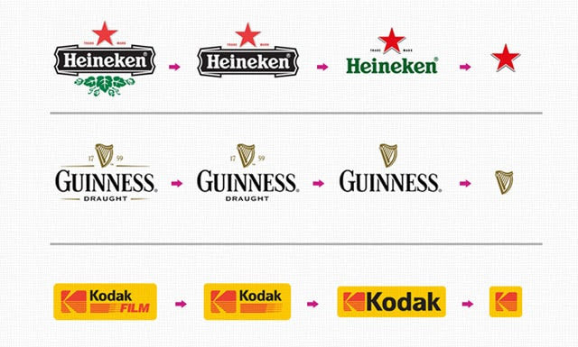
Response to my Response: Yeah, I agree with your take on text logos with regard to small devices. Some brands have been innovative in creating different variations of their logo for device adaptability. Take a look at the Heineken and Guinness logos for instance, they have the main logo(which I call master logo) that contains all the information they want to communicate. Other variations of their logo has some details removed in cases were scaling down is necessary, especially for small and extra small devices. This is actually very innovative and brands should begin to think in that regard.
Comment #2: I will speak from a perspective of a Brand strategist and Identity designer.

As Prof. Ndubuisi Ekekwe said, anything I said is also subjected to scrutiny and can be challenged, but I stand to put out my view.

From the first day that I saw the MTN logo, it was a NO for me for many reasons. The new one is too basic to be the reason to leave the old one ( almost the same reason for flutterwave ). Many people tend to be subjective about it but for a brand like MTN and flutterwave, you have to expect what others can learn from them.

As we can begin to review many reasons why brands change their designs, some things are not just welcomed because it is what everyone can see and not to be subjective about.

My conclusion, in the design industry in alignment with business, if a change of brand identity has nothing to do with a change of rationale for existence to a higher level of convincible evidence, I think anything done is just a show of they don’t care about their perception, image, impression and the place they hold in the mind of their customers. Because I believe the part of the processes of coming up with a new logo should include testing with stakeholders and likes and that should have taken away the subjectivity. Thanks

Mintyn Digital Bank Congratulates Stanley Amuchie for Appointment as ED at Fidelity Bank

0

The innovator has joined Fidelity Bank Plc; he is one of the finest bankers in Nigeria. Join me to congratulate an amazing business leader, Stanley Amuchie, who has been appointed  an Executive Director, Chief Operations and Information Officer of Fidelity Bank. He has done remarkable things including serving as  the Group Chief Financial Officer of Zenith Bank Plc.

He made first class from the University of Benin. But his biggest work (from my angle) is this, from Fidelity Bank  press release: “Between April 2019 and February 2021, Stanley was Chief Technical Consultant at Mint Financial Technologies Limited (now Mintyn Bank, a digital bank). “

Yes, he worked with us to make Mintyn igital Bank one of the nation’s fastest growing neobanks. You see us everywhere – Premiership games,  etc.  Tekedia Capital is an investor in Mintyn which has built a business model where your money can go further with it. Yes, you have N2,000 to buy rice. In Mintyn, you can find others to buy in groups and instead of getting 100 cups, you can go home with 200 cups through bulk purchase.

Mintyn wishes Stanley a great future. We thank him for the leadership he provided to help Mintyn stay in a position to thrive. At Mintyn, we’re minting great future and more opportunities.