

This article was prompted by a post I found on LinkedIn. An animation charted the proportion of GDP of the African Continent from 1961 to 2020. The space afforded by the comments section would not be sufficient for my thoughts.
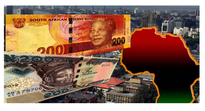
There are a number of observations I would make, mostly about the two top performers over the period, which are South Africa, and of course, Nigeria which is my market and 85% of my LinkedIn Network.
GENERAL
Register for Tekedia Mini-MBA edition 20 (June 8 – Sept 5, 2026).
Register for Tekedia AI in Business Masterclass.
Join Tekedia Capital Syndicate and co-invest in great global startups.
- – No country other than Nigeria and South Africa has held the pole position at any time between 1961 and 2020.
- – The only country to never fall out of a podium position (1,2,3) over the entire period, has been South Africa.
- – Countries to have held podium positions over the period are: Algeria, DRC, Egypt, Nigeria and South Africa.
- – The only country to hold a podium position, and be completely off the pie chart by 2020 is DRC, ( best position: #2 in 1964 and 15% of the pie).
- – The animation ends with South Africa relegated to third place. While Nigeria still leads the continent, at 18% it is barely over half its period high of 35% and the trend has been downwards. The combined portion of the pie occupied by other countries is rising. With Egypt share having recovered to 15%, perhaps the lead swapping monopoly of Nigeria and South Africa that has lasted 60 years may soon be over?
NIGERIA
- At Independence, Nigeria’s share of African GDP was 14% just over half of continent leader South Africa at 25%
- The high point of Nigeria’s African Dominance was 35% of Africa total GDP achieved in 1982. This was in the leadership of Shehu Usman Aliyu Shagari of the ‘Second Republic’
- During the years of an Independent Biafra, Nigeria’s contribution to Africa’s GDP was 9-11%
- The low point in Nigeria’s contribution to Africa GDP was 6% in 1994. This was under General Sani Abacha. Though to be fair, Abacha had only come to power since November 1993 after overthrowing an Interim Government of Chief Ernest Shonekan, who only led for 3 months. The ‘condition’ of Nigeria inherited at the time would have most likely been down to the military rule of Ibrahim Babangida, who led from 1985-1993.
- Nigeria’s share on Abachas departure in 1998 was 9%
- Nigeria’s high, post the recovery from 1994, briefly hit 22% in early 2015 in the final few months of the Goodluck Jonathan Presidency, though surprisingly, he did not achieve a second term.
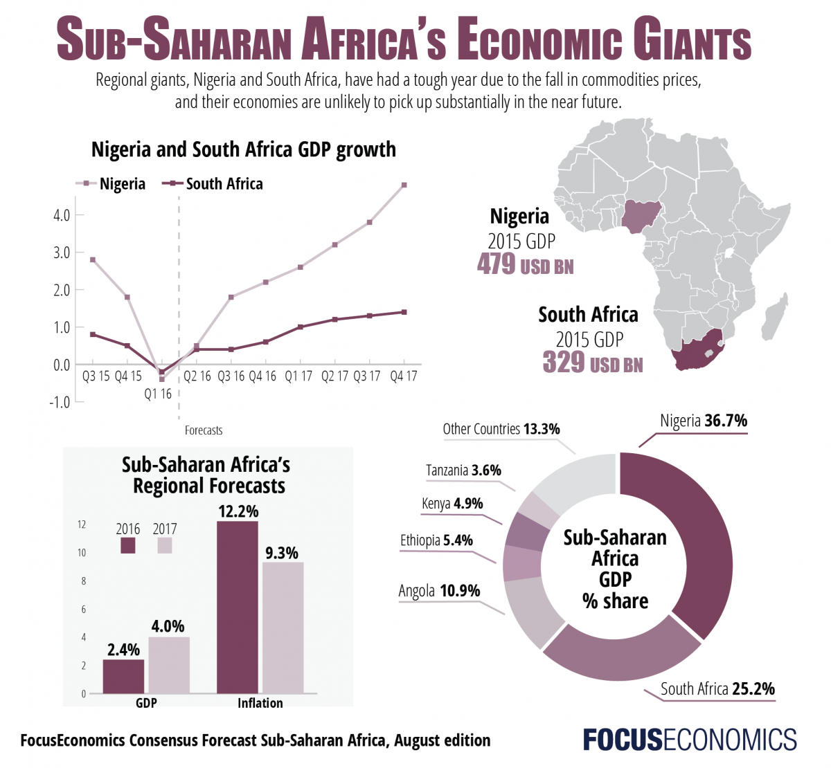
SOUTH AFRICA

- South Africa’s highest position was 29% in 1995, possibly benefiting from the ‘Mandela Effect’.
- South Africa’s highest slice of African GDP during apartheid years was at several points in the 1970’s when it intermittently rose to 26% and again 26% in 1992.
- South Africa’s highest point post Mandela was 24% in 2005 during the second term of the Thabo Mbeki regime. No leader post Mandela has equaled his high of 29% or even the 26% best of apartheid regimes.
- SA finished the period in third place on 13% behind Egypt. This is the lowest share of the continental GDP that South Africa has held for the period of the pie animation. The current President of South Africa is Cyril Ramaphosa who has been in power for 3 years and 9 months.
Closing comments:
It’s important to understand that the pie animation represents relative rather than absolute data. This means that without doing anything particularly remarkable, one country can rise position purely because of something bad happening somewhere else.
It can also mean modest improvements in some countries don’t translate to ranking improvements due to something very remarkable happening somewhere else.

For instance, the ‘Mandela Effect’ a phrase sometimes used to refer to trade and investment benefits South Africa achieved following the end of the Apartheid Regime and the ‘honeymoon period’ the world was having with Nelson Mandela as the new leader of a ‘free’ South Africa.
There would have been nothing any other country in Africa could have done to counter that in terms of competing with SA for trade deals and FDI (Foreign Direct Investment) from outside the continent… at least in the first few years of the Mandela Presidency.
But all honeymoons end!
Links have been added at the end giving timelines of events in some of the countries that have influenced the ranking in the pie animation over time.
For those looking to invest, its also important to understand that choosing a country is a little bit like University Rankings. There are many universities with unremarkable rankings but they have niche expertise in a few very narrow aspects of subject matter or emerging technologies. For someone pursuing a course in these, then an unremarkably ranked university may be second to none.
Equally, Start-up investment destinations are not about overall metrics, they are about the metrics that are particularly important to the specific start-up.
Availability of suitable affordable labour, local demand for products/services, enabling capacity, support willingness and engagement flexibility of Government Structures and Civic authorities, and other aspects of the business ecosystem – these need to be a fit for the investors intentions.
The animation pie starts a journey with much else to be discovered.
Thanks to Instagram Member ‘piechartpirate’ and to Inez Willeboordse for porting the content to LinkedIn where I got to see it.
Alignment of Nigerian and South African leaders with pie animation metrics has been courtesy of Wikipedia.
brainyhistory.com/topics/a/algeria.html
brainyhistory.com/topics/e/egypt.html
brainyhistory.com/topics/c/congo.html
brainyhistory.com/topics/l/libya.html
focus-economics.com/blog/africas-economic-giants-economic-growth-infographic
congo.org.uk/the-economies-in-africa-are-so-disjointed/
kenyanwallstreet.com/africa-poised-us-3-trillion-economy-2030/